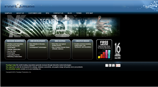
Your website is the crux of your online lead generation funnel and as such, needs to work hard as a lead conversion tool for your site visitors. How do you ensure that it’s doing just that? Realistically, you should be using analytics and forms to monitor the lead conversion rate of any page on your website that includes call to action buttons, links or graphics, which we’ll talk about next week.
Today we’re focusing on the lead generation plan for web content creation that employs a multitude of effective, well-positioned conversion tools on your web pages.
What’s Above the Fold?
Imagine that your website in the form of a folded, full-page advertisement in the newspaper. See it folded in half vertically. Well, everything above that creased line would be, theoretically, “above the fold”.
In the world of web design, “above the fold” refers to any content that resides in the top of a web page that can be seen without having to scroll down the page at all. Above the fold is the action area, the sweet-spot for conversion.
It has become common practice for websites to be built almost 100% “above the fold”, with wider views and shorter pages that give all the relevant, actionable content, at first site. For sites that do require a scroll down to view all page content, it’s important that the real action items, call to action buttons or links, No Risk Offers like email signups or even Low Risk offers like whitepaper downloads, be located “above the fold”.

Lead Conversion Rate above the Fold
Remember, the whole purpose of your website is to be THE lead conversion tool in your marketing arsenal, at the crux of your online marketing plan. It’s also crucial to understand that web readers scan web pages, much more than they read. With that in mind, there are a few points to consider when placing your action items on your web page.
- Draw the Eye: Maybe you have a video download as one of your lead conversion items? Instead of just placing a link to the video on your web page, above the fold of course, use a linked graphic showing the video “ready to play”. Images draw a reader’s eye to action much faster than text and will result in higher conversion rates.
- Color Me Bright: Are you offering a web form that will add names to your email lists? Instead of using the standard font color from your site to reflect the link to the form, use a vibrant color to draw more attention to your form or link.
- Location, Location, Location: If a conversion tool is not getting the response you expected, change its location from one side of the page to the other, or even from the top of the page to the bottom, staying above the fold. Watch your analytics to see if the geography update helps with conversion.
Lead conversion tools won’t do the work for you. You need put them into the path of oncoming traffic on your website to reap convertible sales-funnel benefits.