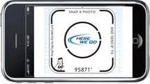
I know it may be hard to imagine that mobile marketing could possibly become more interactive, but SnapTags take mobile landing pages to the next level.
What is a SnapTag?
 A graphic image created for the purpose of driving responses from you, the shopper, with your favorite brand. They can offer you an option to text a code to receive a coupon, register for a newsletter to receive a free download, or just about any other promotion they may be offering. The responses required by the image based on user response are stored in a database, making adjustments to the responses very easy for the brand during the SnapTag lifecycle.
The benefit to simple changes to the response for any tag is the ability to utilize any given tag for several levels of engagement over its lifetime.
Building Your SnapTag
Now that you know what you can use your SnapTag for, it’s time to build it. That requires a 3 stage process: 1.What promotion is it going to support initially? 2. How will it fit into your landing page? (See the next paragraph for more details) and 3. What balance of text/images will work best to get the results you desire?
The great things about SnapTags is that the response rates don’t have to be hardcoded into the graphic itself, once you decide the graphic design you want and the promotion you are sharing within it, you’re finished designing your SnapTag.
Location, Location, Location
The layout of a mobile marketing landing page is integral to the response rates. Too many graphics, or too few, too little white space or a lot of rambling text without getting to a point can shoot the bounce rate of your mobile landing page into orbit.
The goal of a mobile landing page is to drive responses. If the page visitor is bombarded with too many graphics or too much text, it may be hard for them to find your point (a/k/a your SnapTag) which will cause them to bounce away before responding.

To be sure a mobile landing page drives a visitor’s attention to a SnapTag, in lieu of driving them all around the page with the potential of losing them, it should be located near the top half of the page away from other graphics and within a decent amount of white space. Text in the SnapTag should be clear and concise as to what the benefit is and what is expected of them to respond.
SnapTags enhance the interactive quality of mobile landing pages, but like all elements to the page, its design, message and location are vital to its success.