MAKING UNCONVENTIONAL USE OF THE TRADITIONAL
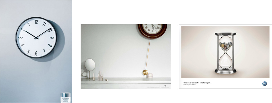
In this first set of ads, LUBRIDERM®, DR. VAN DER HOOG and Volkswagen offer a means of avoiding the future, remaining in the present and turning back time.
The benefit of using LUBRIDERM® skin refresher is conveyed in the ad by using a “counter clock” with numbers displayed in reverse order. Although the right numbers are located in the wrong spots of the clock face, they are positioned where numbers are expected to be found. While the subtle change of numbers may be missed at first glance, its arrangement is enough for viewers to subconsciously recognize the need for a second look.
The ad for DR. VAN DER HOOG literally uses its anti-aging cream to stop time. If a swinging pendulum signifies the passage of time, and the passage of time is associated with aging, then by suspending the pendulum’s motion DR. VAN DER HOOG’s cream also suspends aging.
The Volkswagen ad is for used cars. The headline “Time never passes for a Volkswagen” is illustrated with a “dysfunctional” hourglass. While there is nothing unusual about the oval-shaped glass and narrow neck, the top receptacle is filled with stones instead of sand. The ad’s visual creatively shows how time is controlled, figuratively, by restricting flow to the bottom vessel.
Each of the ads by LUBRIDERM®, DR. VAN DER HOOG and Volkswagen tell time differently – using the same innovative methods. All the ads rely on clear, compelling imagery to carry the message, with limited copy. The ads also replace the familiar with the unexpected. People are accustomed to seeing numbers progressively increase clockwise on the face of a timepiece; they anticipate that pendulums move freely without obstruction; and fine grains of sand flow freely down an hourglass. In each instance, anticipated patterns were broken making the alternative scenario inconsistent with expectations. While each substitution stretches reality, they are also all plausible in the realm of possibility.

TAKING OUTCOMES TO THE EXTREME
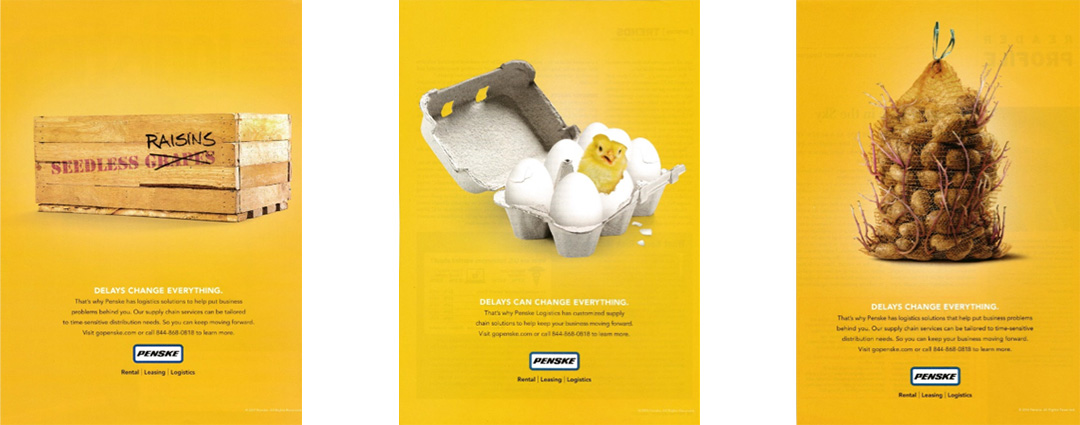
The next set of ads is from a campaign by PENSKE logistics. The theme is “DELAYS CHANGE EVERYTHING” and its focus is on what happens when time-sensitive goods are not distributed on time.
While the outcomes shown is a humorous light-hearted exaggeration, the true ramifications are serious and costly.
As in the ads above, the visuals in the PENSKE campaign are clean, clear and compelling, and the copy is kept to a minimum. However, the PENSKE ads are different because of their focus on the problem instead of the benefit of their solution.

HIGHLIGHTING THE VALUE OF TIME
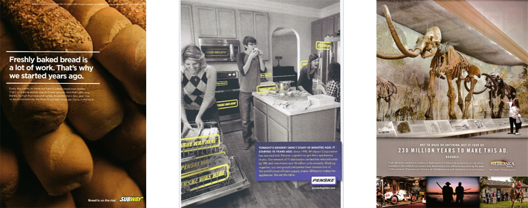
In this last set of examples by SUBWAY, PENSKE and NEBRASKA, time is stated in the headline and its importance is expressed in the copy of each ad. Visuals play a contextual role in these ads, serving as a backdrop to a scene.
Subway has years of experience baking bread daily and wants customers to try what they think is their “best bread yet.” Time equates to experience.
The PENSKE ad reminds readers that dessert would not be enjoyed today had PENSKE not distributed the Whirlpool appliances used to make it – which was made possible because of the relationship they established in 1998.
Nebraska invites tourists to relive the past in the present by exploring 230 million years of its history – which was needed to substantiate their claim of taking that long to create the ad.
SIMILARITIES AMONGST DIFFERENCES
The tale of time is boring and meaningless if told in mundane ways. Ingenious marketers tell time in the context of a narrative creatively using symbolic representation, indirect association and thought provoking copy. They take traditional elements related to time and apply them in unconventional ways. As sophisticated as these techniques first appear, however, they are also simple enough to understand and apply by those who learn them.