When a prospective client lands on your website homepage, what do they see? Bold but well-positioned graphics, well-thought out text that helps answer their needs, and links to your blog or social media content? Or, do site visitors see flashy, graphic-filled home pages that scream “All About US.”
More often than not, websites are thought of as marketing materials, like an ad or flyer, and website home pages can be cluttered and hard to navigate. When you’re talking to a client about their website redesign, it’s pivotal to educate them about what the purpose of the website homepage is. Its primary goal is to entice prospects and site visitors to learn more about the company, its products and services, nothing more, nothing less.
Ultimately, your website home page needs to engage prospects enough to inquire more about your services or products. Therefore, your website is the HUB of your marketing plan, and needs to lay out your message in a simple, visually-pleasing but easy-to-navigate format that will engage your target.
Did you know?
- 75% of Internet users never scroll past the first page of search results.1
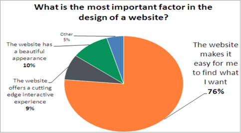
- 76% of consumers want a website that makes it easy to find what they want.2

Website Home Page Tips
• The first impression is all about simplicity.
o That means use graphics that support your content, easy to see navigation buttons and enough content to draw readers further into the site.
• Highlight the company blog on your homepage so your site’s visitors can get a good sense of your organization and your position in the industry.
• Set up a permanent 301 redirect for the sake of SEO. A 301 redirect will send the traffic from any other domain’s you own to your website, ensuring the highest traffic possible.
• Visible links to your Social Media sites are a must for today’s websites. Send your site visitors to your Facebook, Linked In and Twitter to build out your brand image and garner loyalty faster.
Remember, the purpose of your website home page is to be the face of your service or products, not to wow visitors with flashygraphics. Considering that 75% of visitors will never see more than your website home page, you need to be sure it has the creative punch to draw attention from interested prospects, like those built by web marketing specialists.
Attention garnered from your home page must then be directed to your conversion pages, like your contact page, social media pages or e-commerce pages so you can continue the conversation with your prospects on your terms.
1MARKETSHARE.HITSLINK.COM, OCTOBER 2010
2Hubspot, THE SCIENCE OF WEBSITE REDESIGN, JUNE 2011